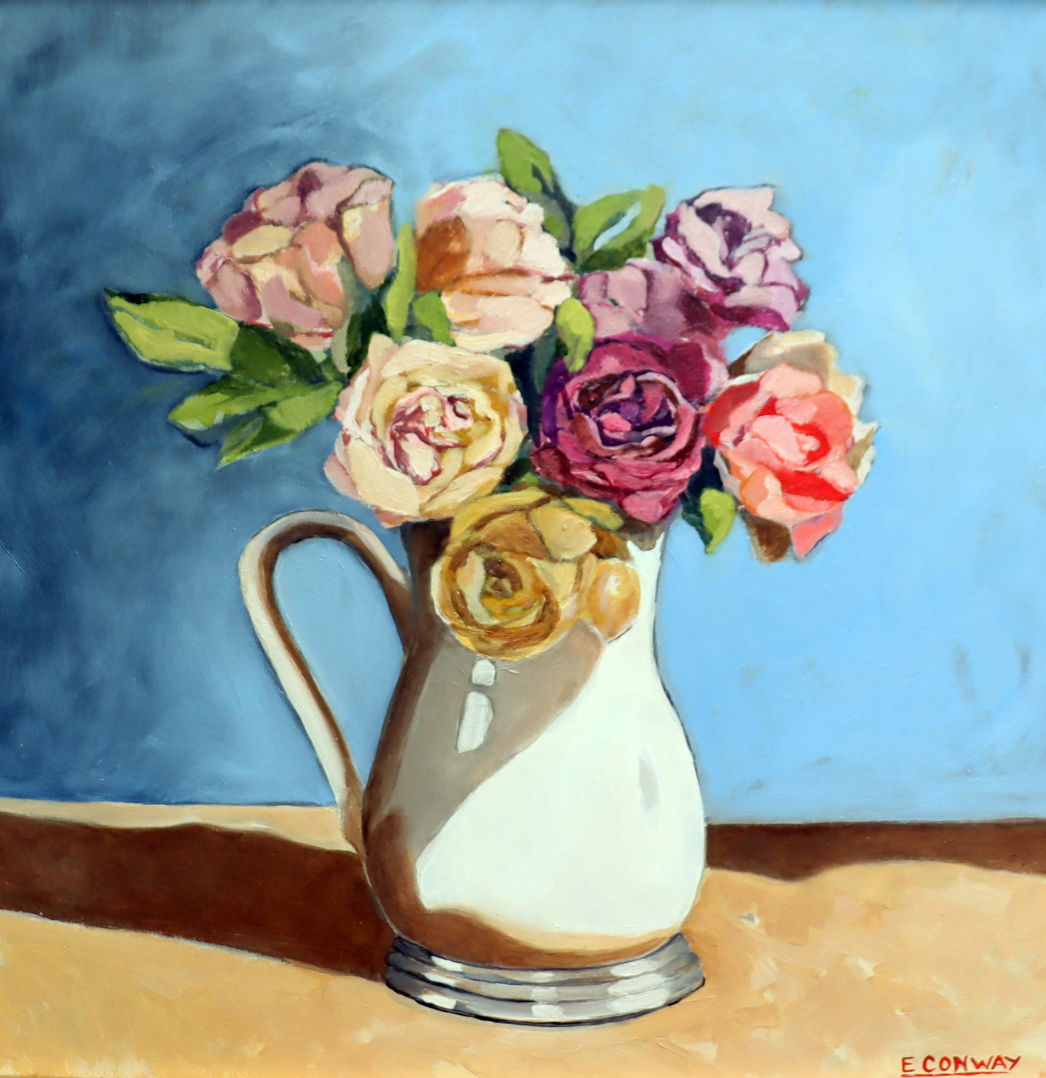
550 x 550 mm
Oil on board
Framed
$950
Stillness in Blue is a painting of roses arranged in a cream jug against a pale blue background. The subject is simple, but the focus of the work is the colour and the quiet mood it creates. I have always been drawn to blue and return to it often in my painting, even when I can’t fully explain why.
Blue can be mixed and used in different ways. Some blues, such as Phthalo Blue, feel cooler and sharper, while warmer blues with a slight purple tone, like Ultramarine Blue, feel softer and more settled. Warm and cool colours are often linked to different psychological responses. Warm colours tend to feel active and energetic, while cool colours are usually associated with calm, distance, and stillness. These effects are subtle, but they influence how a painting is felt as much as how it is seen.
My own connection to blue is both personal and familiar. It is the colour of the sky, the sea, and distant mountains. I have blue eyes, as did my grandmother, and my son does as well. Blue also feels like a colour that suits me in everyday life, in a way that brighter or warmer colours do not. These associations are ordinary and personal, but they shape the way I respond to colour in my work.
In Stillness in Blue, the pale blue background is intended to slow the viewer down and create a sense of quiet. The roses are not meant to be dramatic or symbolic; they are simply there to be observed. The painting reflects my interest in how colour, especially blue, can hold feeling and memory without needing explanation.